Data Engineer Course Final Project - MBTA API
This Project was created as the Final Project in the Big Data Engineer course at Naya College By Nitay Yacobovitch, Shoham Gilady and Dor Izmaylov. We used M...

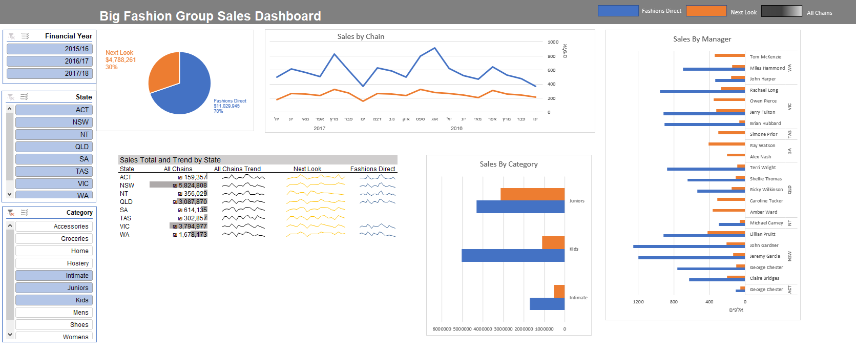
Recommendation on a great video, step by step instruction on creating interactive dashboard from scratch using the built in Excel tools.
The data and dashboard in this file were created by Mynda Treacy from My Online Training Hub.
Great Youtube page that contains excel content (https://www.youtube.com/watch?v=K74_FNnlIF8).
The file contains data for two australia wide fashion stores; Fashions Direct and Next Look. The data is in a tabular format and is classified by date, financial year, chain, location (suburb/ state/ postcode/ country), manager, product category and product buyer. Data on this sheet is from Jan 2016 through June 2017. Approx. 68k rows. Plus the sheet ‘Data Aug’ contains a further 4.5k rows of data for Aug 2017.
With simple techniques of using Pivot tables, and charts for each pivot, we create great and sacalable dashboard that analyze the data from many aspects and can be great tool for any manager/analyst/salesman.
That is my result:
This Project was created as the Final Project in the Big Data Engineer course at Naya College By Nitay Yacobovitch, Shoham Gilady and Dor Izmaylov. We used M...
This post shows an analysis that I did of the solar system at my home - and its performaמce. It contains the total yield from the last 6 years - on top of t...
Recommendation on a great video, step by step instruction on creating interactive dashboard from scratch using the built in Excel tools.
This post shows an analysis that I’ve made of Mcdonalds Menu - The data i used holds information on all of the dishes from their menu, on top of that i made ...